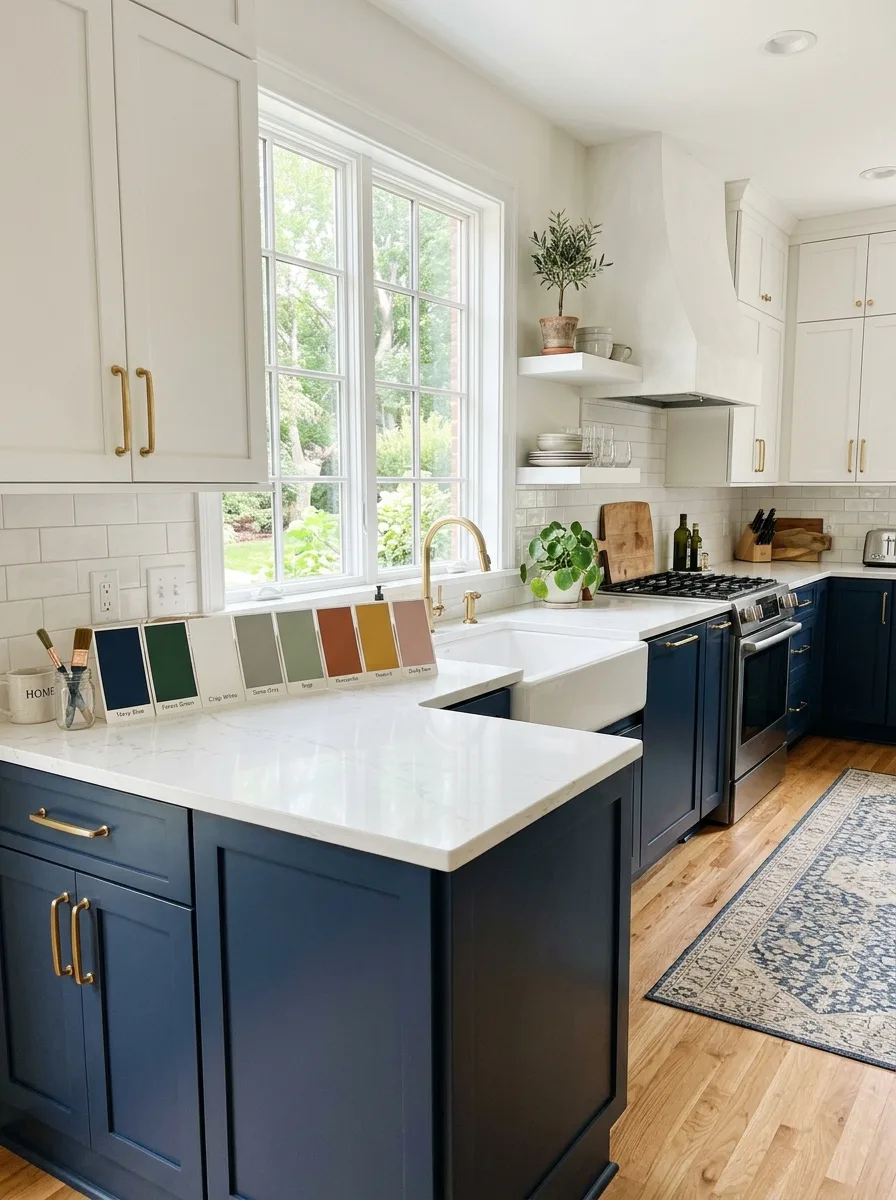
Picking from all the kitchen color schemes out there can feel harder than the remodel itself. Paint is cheap to buy but costly to redo, and a color that looked perfect online can turn dull, cold, or loud once it hits your own walls. The good news is that great kitchen color combinations follow a few simple rules, and you don’t need a design degree to use them.
This guide walks you through how light, size, and undertones shape your choice. You’ll see 15 kitchen color schemes with the exact spots where each color works best, plus advice on pairing kitchen wall and cabinet colors, picking small kitchen paint colors, and avoiding the mistakes that lead to a repaint two years later. Let’s start with the part most people skip.
How to Choose Kitchen Color Schemes That Work for Your Space
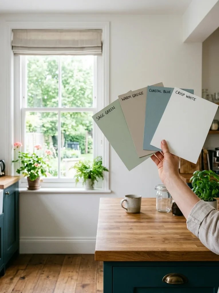
To choose the best kitchen colors, start with your natural light, keep what you aren’t replacing (floors and counters), match the color depth to your kitchen size, and test large paint samples at different times of day before you buy.
Start with Your Light
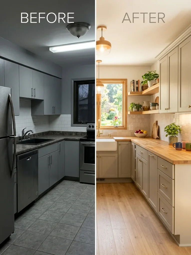
Light changes how every color looks, which is especially important when planning a kitchen makeover before and after transformation. North-facing rooms get cooler, softer light, so colors look more muted and can feel chilly. South-facing rooms bring warmth and richness. East light is soft and warm in the morning and fades by noon, while west light grows stronger in the afternoon and can make colors look more intense.
This is why a white that glows in a sunny kitchen can turn gray and flat in a dim one. If your room is dark, lean toward warm shades like creamy white, pale yellow, or warm greige. If your room is bright, you can handle deeper and cooler colors.
Work Around What Stays
Floors, counters, and big appliances are expensive to change, so build your palette around them. Look at their undertones, which are the hidden warm or cool hints inside a color. A gray with a blue hint looks cold next to a warm oak floor, while a gray with a beige hint blends in. Hold your paint sample right next to the stone, wood, or tile you plan to keep.
Match Color Depth to Kitchen Size
Small kitchens look busier when you use more than two finishes. Large kitchens can handle three or four without feeling chaotic, since each color has room to claim its own zone. If your kitchen is small, choose light, reflective shades or go all in on one deep color so the eye sees fewer breaks.
Use the 60, 30, 10 Rule
This old design rule keeps color under control. Let one main neutral, like white or wood, take up about 60 percent of what you see. Use a second color for about 30 percent. Save the last 10 percent for a bold accent, such as lower cabinet fronts, bar stools, or a backsplash. Stop at two or three bright spots, because a fourth almost always tips the room into noise.
Test Before You Commit
Don’t pick a color from a phone screen or a chip under store lights. Paint a big board, tape it to the wall, and look at it in the morning and evening for a few days. Check it next to your counters, floor, and cabinets. This one habit prevents most repaint regrets.
15 Kitchen Color Schemes to Try
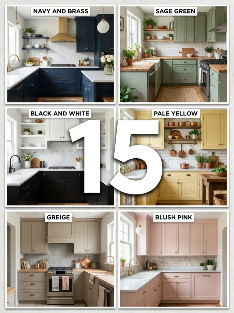
Here are 15 kitchen color schemes, grouped from classic to bold. For each one, you’ll see where the colors go, which kitchen suits it, and the common way it goes wrong.
1. White on White with Warm Wood
White-on-white kitchen paint colors feel clean and bright, but only if you vary the whites. Use slightly different whites on the walls, cabinets, and trim to add depth. Add a warm wood floor, a butcher block counter, or open shelves so it doesn’t feel sterile. This scheme needs steady natural light, and it works especially well in small kitchens. The mistake is matching every white exactly, which flattens the room into one blob.
2. Navy Blue and Brass
Navy with brass is a dependable favorite. Put navy on the lower cabinets or just the island, keep the uppers white or cream, and use brass for the faucet, a pendant light, or a few pulls. A cooler navy looks crisp in daylight, while a warmer navy suits rooms with yellow toned bulbs. The mistake is brass on every single handle, which can look like a kit instead of a collected kitchen.
3. Sage Green and Cream
Sage green is one of the most forgiving kitchen colors. A muted sage, which has gray in it, works in small or dim kitchens because it stays quiet. Pair it with cream walls, natural wood, and warm brass or aged metal. Skip chrome, which can make green feel cold. Test your green at home, since some greens turn gray blue under kitchen bulbs.
4. Black and White with a Wood Buffer
Black and white is a modern classic, but it needs a warm buffer. Use black on the lower cabinets or island, white on the uppers, and add wood on a counter, shelf, or stools. In a small or dim kitchen, flip the ratio and use mostly white with thin black touches like window frames or lights. The mistake is solid black on every lower cabinet in a small room, which can feel tight.
5. Buttery Yellow and Steel Gray
Pale yellow is a smart pick for dark or north facing kitchens because it mimics sunshine. Put it on the walls or upper cabinets, and pair it with gray counters, a gray backsplash, and stainless steel or chrome for an industrial feel. Choose a yellow with a little gray or green in it. Yellows that lean orange can look dated and heavy.
6. Greige and White with Warm Wood
Greige blends beige and gray, so it feels calm without turning cold. Use it on cabinets, then add a white backsplash, light wood, and a few plants. It is a good fix if you keep circling gray but worry it will feel flat. Add texture through tile, stone, or a wood counter, so the room doesn’t look lifeless.
7. Light Gray and White with Natural Stone
Gray remains popular because it grounds stone counters, wood floors, and metal finishes. Pick two or three grays with matching undertones to build depth. Add a wood counter, brass fixture, or patterned tile to bring warmth. Avoid a cool blue gray in a dim room, because it can feel damp and cold.
8. Cherry Cabinets with Olive Green or Cream
If you want kitchen color schemes with cherry cabinets, olive green and cream are two strong partners. Red and green sit opposite each other on the color wheel, but olive keeps it earthy rather than festive. Cream walls and a neutral backsplash calm the warm red brown wood. Rich pairings like this suit larger kitchens, while smaller kitchens do better with paler shades of each color.
9. Blue and Green in Separate Zones
Blue and green are close on the color wheel, so they often blur together. The trick is separation. Use blue on the island and green on the perimeter cabinets, or the other way around. Make sure the two shades differ in tone, or they will look like one confused color. This works best in larger kitchens with enough surface for each zone.
10. Terracotta or Brick Red with Wood
Red scares people because they picture it everywhere. Use it as one strong accent instead. A muted brick or terracotta island, or a full height tile backsplash, looks rich next to natural wood cabinets. It pairs well with black accents for a modern take. Keep the rest of the room neutral, so the kitchen feels cozy and not like a diner.
11. Blush Pink and White
Soft pink is climbing in popularity, especially with marble, gold, and butcher block. Try pink walls with white shaker cabinets, or start small with pink towels and cups. For a more grown up feel, pair dusty rose with a mossy green island. Skip bright bubblegum pink and kelly green together, which can feel like a toy aisle.
12. Plum and Brass
A deep plum or aubergine island with brass hardware and pale walls feels as refined as navy. Dusty, warm purples look like a choice, while bright purples can feel like a prop. This scheme works in larger, well lit kitchens, since deep purple can swallow a small room.
13. Forest Green and White
Deep forest green with crisp white and natural wood feels earthy and calm, making it a beautiful choice for a minimalist kitchen design. In a small kitchen, try green on the island only so the room stays open. It needs plenty of light, because bottle green can feel heavy in a dim space. Add light counters and a white backsplash to keep it fresh.
14. Aqua Blue, White, and Orange Accents
Blue and orange are opposites on the color wheel, so they make each other pop. Use a soft aqua or sky blue on cabinets, white on walls, and small hits of orange in stools, a rug, or a kettle. This is one of the cooler colors for kitchen walls and cabinets that still feels playful. Keep orange to the 10 percent accent slot.
15. The Colorful Kitchen Done Right
Colorful kitchens work when the base stays calm. Start with a white or wood base for 60 percent of the room. Add a second color, then limit your brights to two or three spots, such as cobalt, yellow, or coral lower cabinet fronts. This works in large, bright kitchens. In small ones, the same colors turn into visual noise.
Kitchen Wall and Cabinet Colors: How to Pair Them
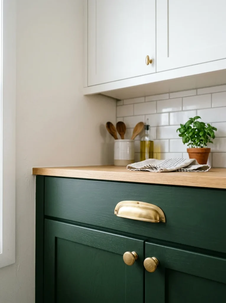
Getting kitchen wall and cabinet colors right comes down to contrast and finish.
Use contrast on purpose. Dark cabinets look best against light walls, such as white, taupe, or soft pastel. Light cabinets can take a deeper wall color. Two tone cabinets, with dark lowers and light uppers, anchor the room while keeping the eye lifted.
Pick the right finish. Walls do well in a washable, moisture resistant finish. Cabinets need something tougher, usually satin or eggshell, since hands and grease hit them daily. Cabinet specific paints, including Behr cabinet paint lines, are made to resist chipping and scrubbing. Always follow the label for cleaning, sanding, and priming, because prep decides how long the finish lasts.
Don’t forget the ceiling. A bright, low undertone white is a classic choice for kitchen ceilings and upper cabinets, since it bounces light.
Coordinate appliances and hardware. Stainless steel works as a neutral in almost any palette. Black stainless and white appliances also fit neutral schemes. Panel ready appliances can be covered with a matching cabinet front for a seamless look. Hardware is the cheapest part to swap later, so it is a smart place to experiment.
Best Kitchen Colors by Size and Style
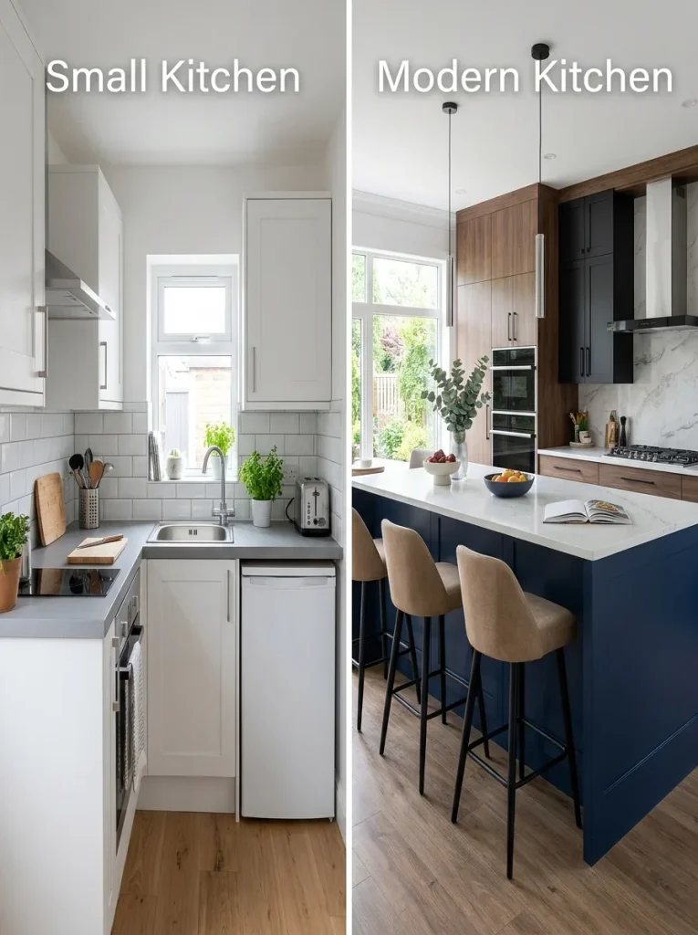
Small kitchen paint colors. White, soft gray, and sage reflect the most light and make a compact room feel open. Using similar whites on the upper and lower cabinets removes visual breaks and makes the room look deeper. All black or all gray kitchens can also work, since one color reduces clutter. Navy with white adds definition to a tiny open plan space.
Modern kitchen color schemes. Warm neutrals, earthy greens, and deep blues are leading modern choices. Add texture with matte and glossy finishes, stone, and wood so a quiet palette still feels rich.
Cool colors for kitchen walls. Pale blue, soft gray green, and misty gray calm a busy room. They look best in sunny or south facing kitchens, where the light adds warmth. In a dim kitchen, warm them up with wood and brass.
By layout. In a galley kitchen, bright white cabinets pull light down the narrow space. In an L shaped kitchen, try charcoal or deep greige on the lowers with white uppers. In a U shaped kitchen, mid tone lowers like warm sand help the walls from closing in. In an open concept kitchen, repeat the same low saturation shades, woods, or metals from the living area so the spaces flow.
Rustic or older homes. If you have old trim, scratched wood floors, and uneven plaster, let warm neutrals and texture do the work. Mix matte with glossy and rough with smooth so beige doesn’t look flat.
Kitchen Color Trends Worth Knowing
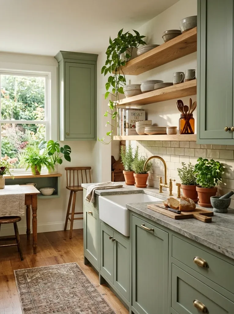
White and warm neutrals remain the most popular choices, with creamy alabaster, soft taupe, and sage in the spotlight. Earthy greens, deep blues, and clay reds are rising as statement colors. Pink is also making a comeback in kitchens that want personality. Natural textures like wood, stone, and plaster are popular too.
Treat kitchen color trends as inspiration, not instructions. The kitchens that get redone every few years are usually picked to match a trend instead of the room. Choose by light and size first, then keep one flexible element, such as hardware or open shelf styling, so you can refresh the look without repainting.
Common Kitchen Color Mistakes to Avoid
- Choosing a swatch from a screen or store lighting instead of your own windows
- Ignoring the undertones of floors and counters you are keeping
- Using too many finishes in a small kitchen
- Matching every white exactly, which flattens the room
- Using dark colors on every surface in a dim room
- Skipping the sample board and buying the full can first
- Adding a fourth bright color instead of stopping at two or three
Frequently Asked Questions
What are the best kitchen colors?
White, cream, soft gray, greige, and sage green are the safest and most popular kitchen colors. Navy blue and forest green are strong picks if you want more depth. Choose based on your light and kitchen size.
What is the best color scheme for a small kitchen?
Light, reflective shades such as white, soft gray, or sage work best because they bounce light and make the room feel bigger. You can also use one deep color on the whole room so there are fewer visual breaks.
What colors go with dark cabinets?
Light colors like white, taupe, or soft pastels give dark cabinets strong contrast. A patterned backsplash or accents in a similar shade can add more interest.
How do I choose kitchen paint color schemes if I have wood cabinets?
Warm earth tones, off whites, and nature inspired greens pair well with wood. Look at the undertone of the wood first, then pick a wall color that either matches that warmth or balances it gently.
Are warm or cool kitchen colors better?
Warm neutrals like sand, taupe, and cream are more popular because they feel soft and inviting. Cool colors work well in sunny rooms. Your light and floor tones should make the final call.
Conclusion
The best kitchen color schemes come from your room, not a trend list. Start with your light, respect the floors and counters you are keeping, match the color depth to your kitchen size, and use the 60, 30, 10 rule to keep things balanced. Then test a big sample before you commit.