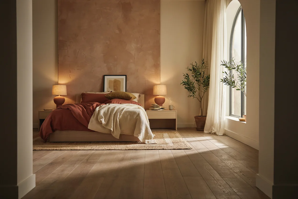
Choosing a color palette is the single most important decision in any bedroom refresh, setting the mood before you even pick out furniture. Whether you want a space that feels calm, cozy, glamorous, or bright, these color palette bedroom decor ideas will help you craft the exact atmosphere you are aiming for.
Some homeowners love the rich drama of jewel tone bedroom decor, with deep emeralds and sapphires throughout the space. Others prefer something softer, like blue and gray bedroom decor or a gentle pink and green bedroom decor pairing. Both directions can look stunning when done thoughtfully.
This guide walks through ten distinct color palette combinations, complete with styling tips for each. You’ll learn how to balance bold colors like navy blue and pink bedroom decor, and how to layer neutrals like beige and black bedroom decor for a more subtle effect. By the end, you’ll have a clear direction for your own bedroom’s next transformation.
1. Jewel Tone Bedroom Decor
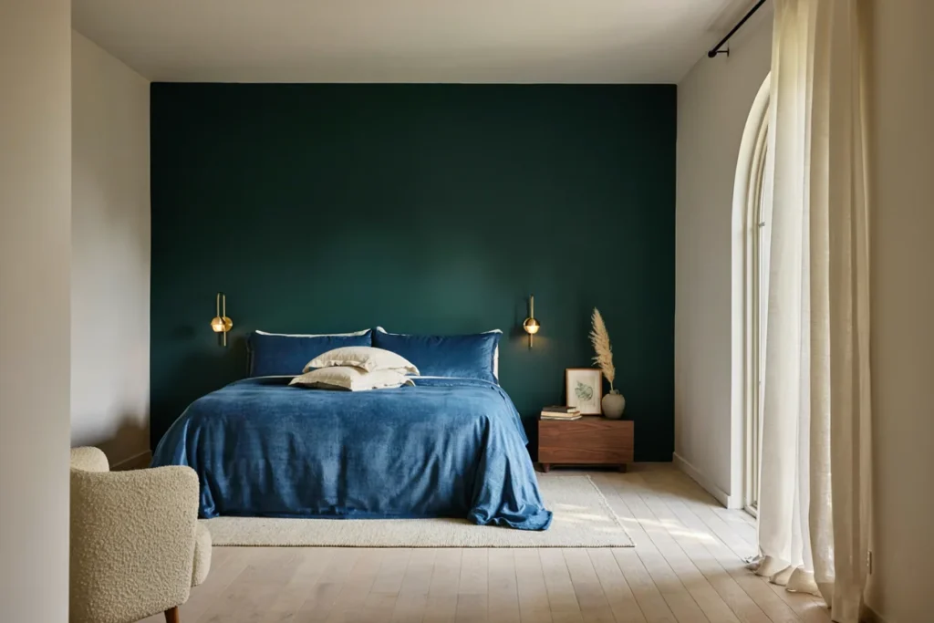
Jewel tone bedroom decor uses rich, saturated colors inspired by gemstones. Think emerald green, sapphire blue, ruby red, and amethyst purple. This palette creates a dramatic, luxurious feeling the moment you walk in.
The key to jewel tone bedroom decor is balance between color and neutral space. Use one or two jewel shades as the main focus, often through bedding or an accent wall. Keep surrounding walls and large furniture in softer, neutral tones.
Metallic accents amplify the richness of this palette beautifully. Gold or brass lighting fixtures and hardware pair especially well with emerald and sapphire tones. Velvet textiles also enhance the luxurious, saturated feel of jewel-toned rooms.
To keep the space from feeling too heavy, add plenty of natural light and a few lighter textiles. A cream or ivory rug can balance darker jewel tones without diluting their richness.
Consider mixing two complementary jewel shades, like emerald and sapphire, rather than one alone. This combination adds depth while still feeling cohesive and intentional throughout the room.
2. Blue and Gray Bedroom Decor
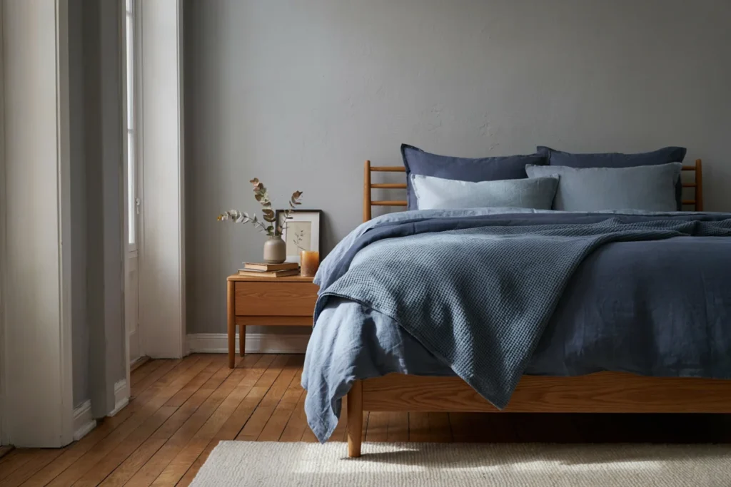
Blue and gray bedroom decor is one of the most versatile and calming palettes available. Grey and blue bedroom decor works in nearly any home style, from coastal to modern farmhouse. It reads as soothing without feeling cold or sterile.
Start with a soft gray wall color as your base, then layer in blue through bedding and textiles. Navy accents add depth, while lighter powder blue keeps the room feeling airy. This range gives you plenty of flexibility to adjust the mood.
Wood tones warm up this palette nicely. A honey or walnut wood bed frame prevents the room from feeling too cool or clinical. White trim and crisp linens also help keep the space feeling fresh and clean.
For visual interest, mix textures rather than adding more colors. A chunky knit throw, a woven rug, and smooth velvet pillows all work beautifully within this same blue and gray palette.
This palette also photographs beautifully for design boards and social sharing, since the cool tones read consistently across different lighting conditions and camera settings.
3. Teal and Gold Bedroom Decor
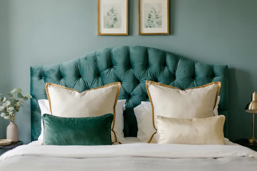
Teal and gold bedroom decor combines a rich, jewel-adjacent blue-green with warm metallic shine. It feels sophisticated and a little glamorous without being overly formal. This pairing works especially well in primary bedrooms.
Use teal as your dominant color through an accent wall, headboard, or bedding set. Gold should appear in smaller, supporting doses through lighting, mirrors, and hardware. This ratio keeps the room feeling balanced rather than overwhelming.
Velvet and silk textures pair beautifully with this color combination. A teal velvet headboard with gold-trimmed pillows instantly elevates the whole room. Even simple gold picture frames can tie the palette together nicely.
Plants add a natural, unexpected element to teal and gold bedroom decor. Their green tones bridge the two main colors while adding life and texture to the space.
A gallery wall with gold frames against a teal accent wall creates an especially strong focal point above the headboard, tying the whole palette together in one clear statement.
4. Green and Gold Bedroom Decor
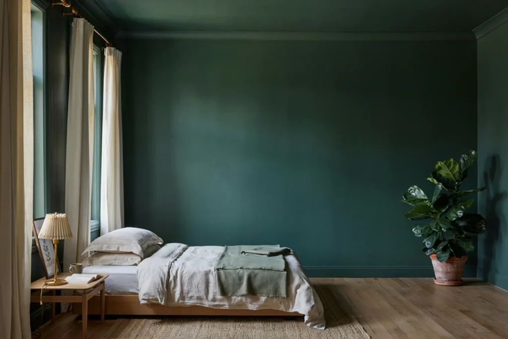
Green and gold bedroom decor brings an earthy, elegant feeling into the bedroom. Deep forest greens paired with warm gold accents create a rich, nature-inspired palette. It works beautifully in both traditional and modern spaces.
Sage or olive green offers a softer alternative to deeper forest shades if you prefer a calmer feel. Either version pairs well with gold curtain rods, lamps, and mirror frames. The warmth of gold keeps green from feeling too cool or somber.
Botanical prints and real houseplants reinforce this palette’s natural inspiration. A large leafy plant in the corner ties the room’s color story together effortlessly. Textured woven baskets add another layer of organic warmth.
Keep bedding relatively simple within this palette, using solid green or cream as your base. Save bolder patterns for a single accent pillow or throw to avoid visual competition.
Wood furniture in warm honey or walnut tones anchors this palette naturally, since it echoes the earthy inspiration behind the green and gold combination.
5. Ivory and Gold Bedroom Decor
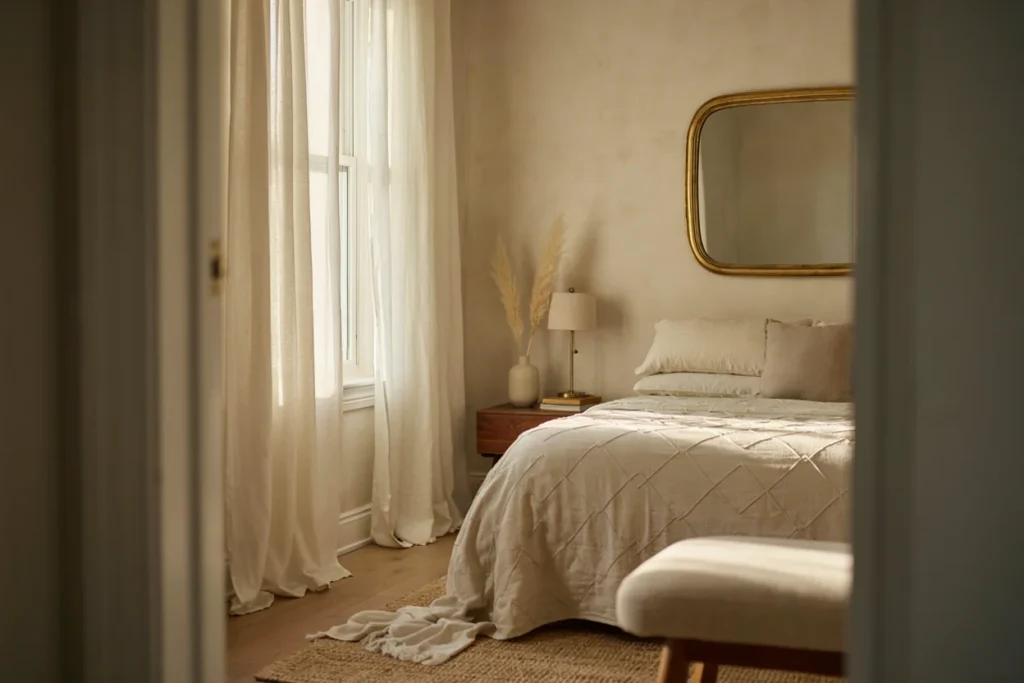
Ivory and gold bedroom decor creates a soft, romantic, and slightly glamorous atmosphere. This palette feels bridal and light, perfect for anyone who loves a bright, airy bedroom. It works especially well in primary suites and guest rooms.
Layer different shades of ivory and cream for depth, rather than relying on one flat white tone. Gold should appear through lighting fixtures, mirror frames, and decorative hardware throughout the room. This creates subtle shine without overwhelming the soft palette.
Textured bedding, like a quilted or ruffled duvet cover, adds visual interest within this mostly neutral scheme. A gold-framed mirror above the dresser reflects light beautifully throughout the day. Sheer curtains further enhance the room’s soft, airy feeling.
To prevent this palette from feeling flat, add one deeper accent color in small doses. A blush pink or soft sage pillow keeps the ivory and gold combination from feeling monotonous.
Layered lighting also elevates this palette significantly. A chandelier, table lamp, and wall sconce working together create the soft, romantic glow this style depends on.
6. Pink and Green Bedroom Decor
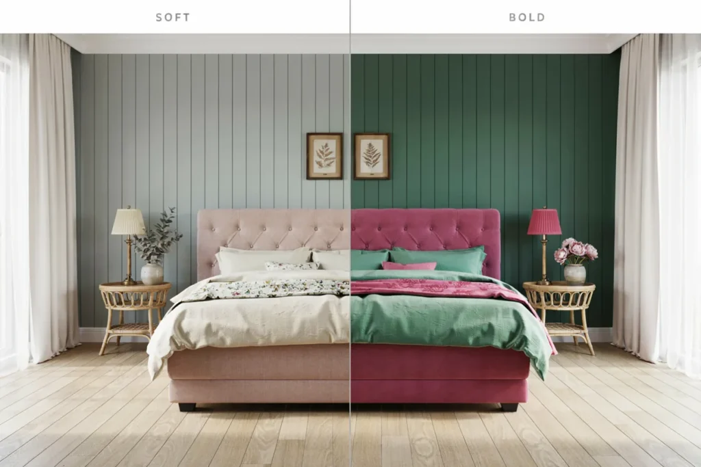
Pink and green bedroom decor is a classic combination that feels both fresh and timeless. This pairing works in soft pastel versions or bolder, more saturated tones. Both directions create a cheerful, inviting bedroom atmosphere.
For a softer look, pair blush pink walls with sage green bedding and botanical prints. This combination feels calm and cottage-inspired throughout the room. Wicker and rattan furniture pieces complement this gentler version beautifully.
A bolder take uses hot pink accents against deep emerald or forest green as the base. This version feels more modern and confident, especially in a teen or young adult bedroom. Gold hardware adds a touch of shine to either version of this palette.
Floral patterns naturally reinforce pink and green bedroom decor, since the combination already appears throughout nature. A floral wallpaper accent wall or patterned bedding set ties the whole room together effortlessly.
This palette works well at nearly any age, since the pink-to-green ratio can shift gradually as personal taste changes over the years.
7. Beige and Black Bedroom Decor
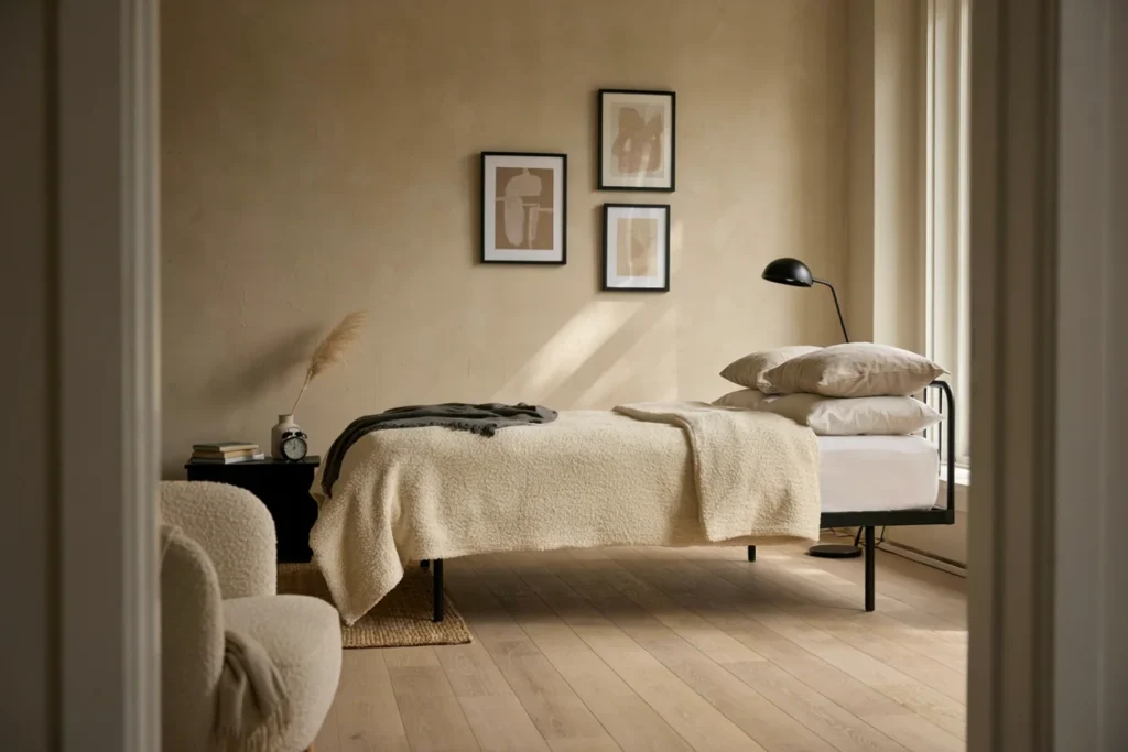
Beige and black bedroom decor offers a sophisticated, high-contrast neutral palette. It feels modern and grounded without relying on bold color. This combination has become especially popular in minimalist and contemporary bedroom design.
Use beige as your dominant wall and bedding color, then introduce black through furniture and lighting fixtures. A black bed frame or nightstand adds contrast and visual weight to the room. Black picture frames or a statement mirror reinforce this same grounding effect.
Texture becomes especially important within this neutral palette. Boucle, linen, and woven textiles add richness that color alone would normally provide. Layer several beige tones together, rather than a single flat shade, for added depth.
Keep black accents intentional and evenly distributed throughout the room. Too much black can feel heavy, while too little loses the contrast that makes this palette so striking in the first place.
A black-framed window or door nearby reinforces this palette naturally, so consider echoing that same finish through smaller accessories around the room.
8. Blue and Silver Bedroom Decor
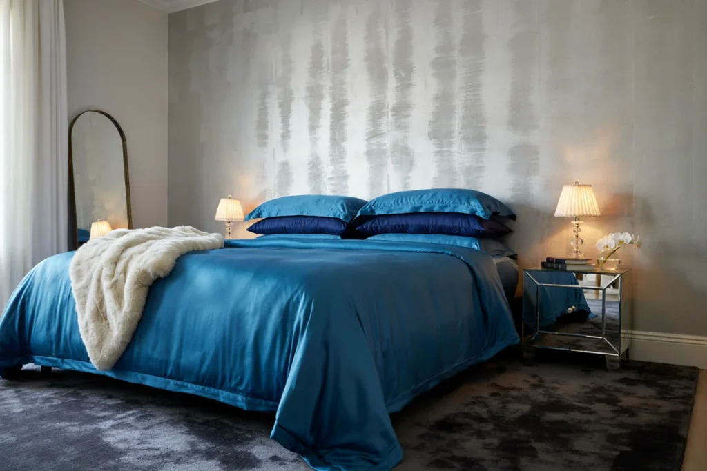
Blue and silver bedroom decor creates a cool, elegant, slightly glamorous atmosphere. This palette works beautifully in modern and contemporary bedroom designs. It reads as calm, crisp, and a little luxurious all at once.
Navy or cobalt blue works well as a dominant color through bedding or an accent wall. Silver should appear through mirrored furniture, lighting, and decorative hardware throughout the space. Mirrored nightstands are an especially popular choice within this palette.
Metallic wallpaper in silver or pewter tones adds subtle shimmer without overwhelming the room. Pair it with crisp white trim to keep the overall look feeling fresh rather than heavy. Glass and crystal accessories further enhance the cool, polished feel.
For warmth within this cooler palette, add plush textiles like a faux fur throw or a thick area rug. This prevents the room from feeling too cold or clinical despite the metallic accents.
Blackout curtains in a deep navy shade reinforce the palette while also improving sleep quality, making this combination as functional as it is stylish.
9. Gray and Yellow Bedroom Decor
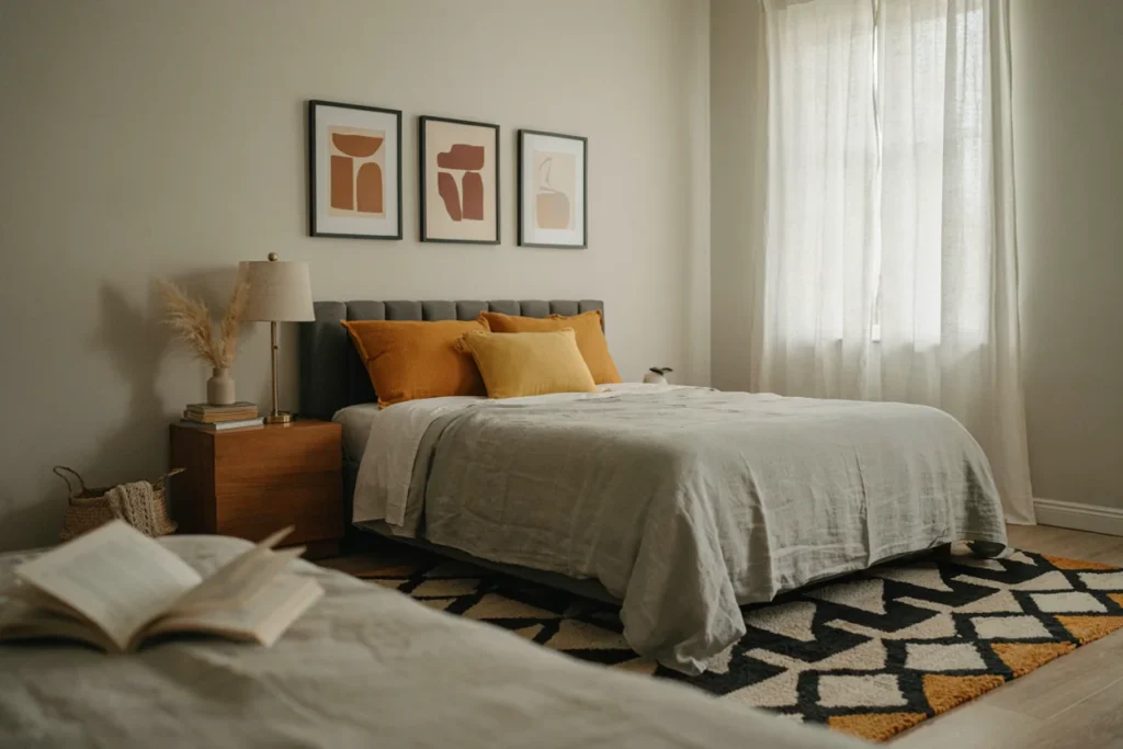
Gray and yellow bedroom decor pairs a calm neutral base with an energizing pop of color. Grey and yellow bedroom decor works especially well for anyone wanting a cheerful, modern bedroom. It feels balanced rather than overly bright or busy.
Use gray as your dominant wall and furniture color, keeping the palette calm and grounded. Introduce yellow through bedding, throw pillows, and artwork in smaller, controlled doses. This ratio keeps the energizing color from feeling overwhelming.
Mustard yellow offers a more muted, sophisticated alternative to brighter lemon shades. It pairs especially well with charcoal gray for a cozy, autumn-inspired feel. Brighter yellow tones work better against lighter dove gray backgrounds instead.
Geometric patterns in gray and yellow reinforce this palette’s modern, energetic feel. A patterned area rug or accent chair adds interest without requiring any wall color changes at all.
This combination also works especially well in home offices or reading nooks attached to a bedroom, since yellow is known for supporting focus and energy.
10. Navy Blue and Pink Bedroom Decor
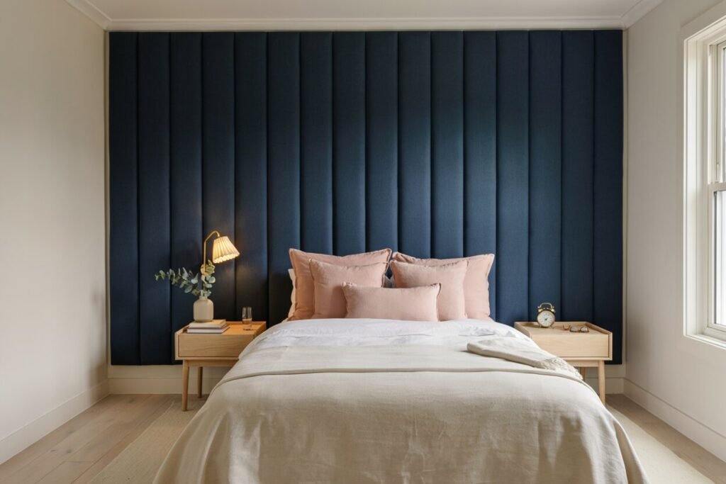
Navy blue and pink bedroom decor combines a deep, grounding neutral with a soft, feminine accent. This unexpected pairing has become increasingly popular in both adult and children’s bedrooms. It feels balanced, confident, and surprisingly versatile.
Use navy as your dominant color through walls, bedding, or a statement headboard. Blush or dusty rose pink works best in supporting doses through pillows and accessories. This balance keeps the room from feeling too dark or too sweet.
Gold or brass hardware bridges these two colors beautifully, adding warmth to the cooler navy base. A brass reading lamp or picture frames tie the whole palette together effortlessly. White trim also helps keep the combination feeling crisp and current.
This palette works particularly well for anyone transitioning a child’s room toward a more grown-up feel. The navy base feels mature, while soft pink accents can be swapped easily as tastes change over time.
Striped or scalloped bedding in these two tones adds a playful, tailored feel that works nicely in both kids’ rooms and sophisticated primary suites alike.
Quick Shopping Checklist by Palette
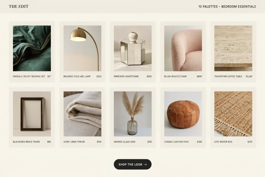
Use this simple checklist as a starting point for your next bedroom color palette refresh. Focus first on bedding and one accent piece before committing to a full room repaint.
- Jewel tone bedroom decor: velvet bedding, gold lighting, cream rug
- Blue and gray bedroom decor: layered blues, wood bed frame, white trim
- Teal and gold bedroom decor: velvet headboard, gold frames, plants
- Green and gold bedroom decor: botanical prints, gold curtain rod, houseplant
- Ivory and gold bedroom decor: quilted bedding, gold mirror, sheer curtains
- Pink and green bedroom decor: floral wallpaper, rattan furniture, wicker accents
- Beige and black bedroom decor: black bed frame, boucle textiles, layered beige tones
- Blue and silver bedroom decor: mirrored nightstand, metallic wallpaper, faux fur throw
- Gray and yellow bedroom decor: mustard accent pillow, geometric rug, charcoal bedding
- Navy blue and pink bedroom decor: brass lamp, blush pillows, white trim
How to Choose the Right Color Palette
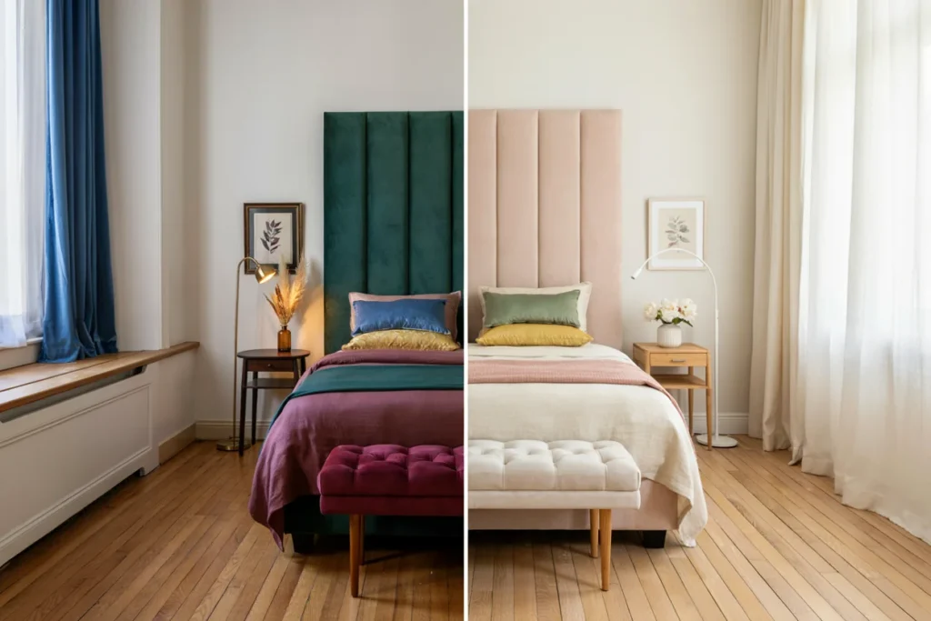
Start by considering the room’s natural light throughout the day. Darker palettes, like jewel tones or navy combinations, work beautifully in rooms with plenty of natural light. Rooms with less light often look better in softer, brighter palettes instead.
Think about the mood you want your bedroom to create every morning. Calm, cool palettes like blue and gray suit anyone wanting a peaceful retreat. Bolder combinations like teal and gold suit those wanting a more energizing, glamorous space.
Consider your existing furniture before committing to a full palette change. Wood tones, in particular, should guide your color choices since replacing large furniture pieces is costly. Warm wood pairs best with gold, green, or beige-based palettes.
Finally, think long-term about how easily you can update the palette later. Neutral-based combinations, like beige and black, are easier to refresh than bold, fully saturated color schemes.
Tips for Balancing Two-Color Palettes
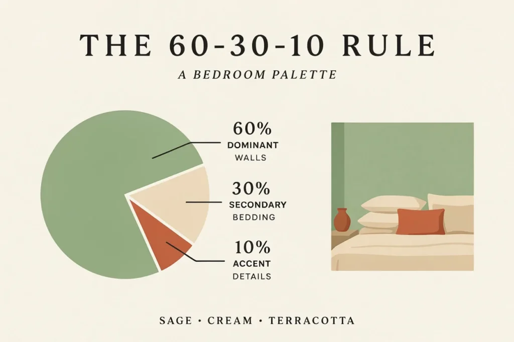
Follow the sixty-thirty-ten rule for the most balanced results. Sixty percent of the room should be your dominant color, usually walls and large furniture. Thirty percent should be your secondary color, and ten percent should be reserved for accents.
Test paint and fabric swatches directly in the room before committing to anything. Colors shift dramatically under different lighting throughout the day. What looks perfect in a store can appear completely different once it’s home.
Layer textures within your chosen palette to add depth without introducing more colors. Velvet, linen, and knit textiles all read differently even in the same shade. This technique keeps a two-color room from feeling flat or boring.
Don’t forget the ceiling and trim when planning your palette. A painted ceiling, in a soft complementary shade, can dramatically change how the whole color combination feels.
Testing a Palette Before You Commit
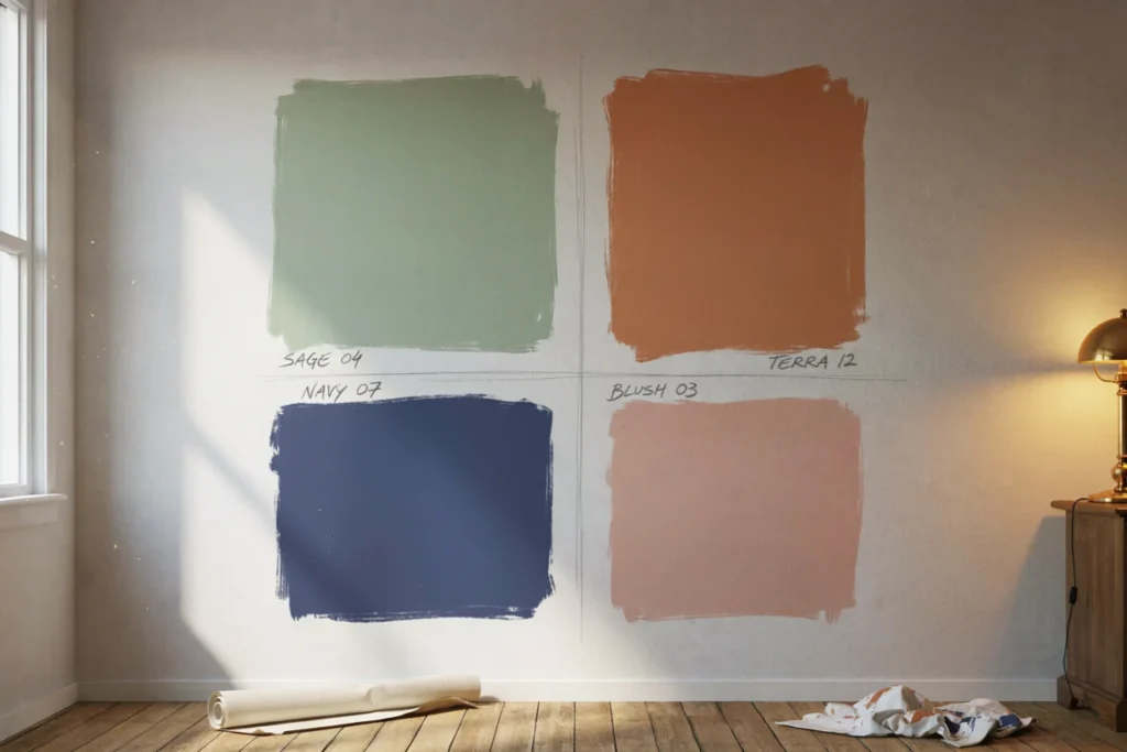
Paint large swatches directly on the wall, rather than relying on small paper chips. View them at different times of day, since morning and evening light shift color dramatically.
Photograph the swatches on your phone alongside your existing furniture and flooring. This simple trick often reveals clashing undertones that are harder to spot with the naked eye.
Live with your top choices for at least a few days before making a final decision. Colors that feel exciting in the store sometimes feel too bold once they surround you daily.
If you’re hesitant to commit to a bold palette, start with removable options first. Peel-and-stick wallpaper, bedding, and curtains let you test a combination before investing in permanent paint or furniture.
Keep a small folder or phone album of your chosen swatches, fabric samples, and reference photos. This makes shopping far easier later, since you can match new pieces accurately while out browsing stores.
Common Mistakes to Avoid
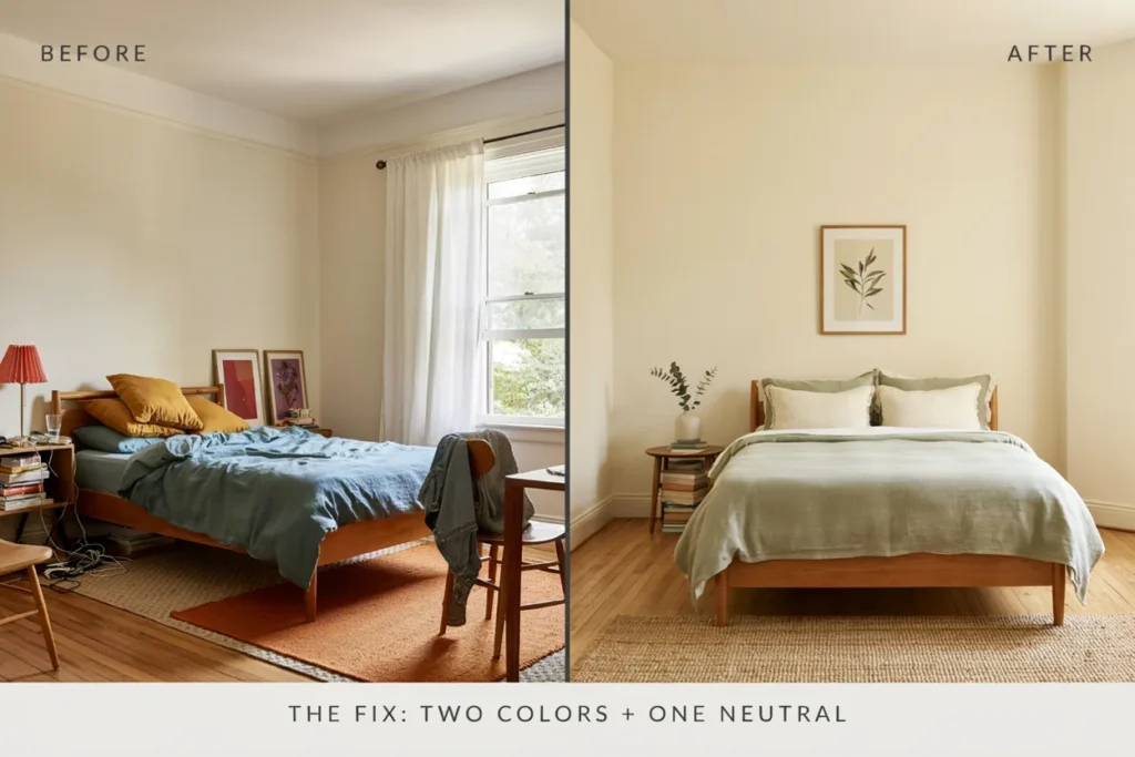
Choosing too many competing colors at once is the most frequent mistake in bedroom design. Stick to your two main colors, plus one metallic or neutral accent at most. This keeps the palette feeling intentional rather than chaotic.
Ignoring undertones is another common issue, especially with grays and neutrals. A gray with blue undertones can clash with a warm gold accent. Always test paired swatches together before finalizing your final palette choice.
Skipping a neutral resting point is also easy to overlook. Even bold palettes like jewel tones need some visual breathing room. White trim, ceilings, or flooring usually provide this necessary balance.
Finally, forgetting about lighting temperature can throw off an otherwise perfect palette. Warm bulbs enhance gold and green tones, while cooler bulbs suit blue and silver palettes better.
Frequently Asked Questions
What is the most popular bedroom color palette right now?
Jewel-tone and blue-and-gray bedroom decor are both trending right now, offering two very different moods. Jewel tones bring drama through emerald and sapphire shades, while blue and gray stays calm and versatile. Both work across multiple home styles, making them the top picks for a 2026 bedroom refresh.
Can I combine jewel tones with a neutral palette?
Yes, pairing jewel tones with a neutral base is the easiest way to try this bold look without overwhelming the room. Use one or two jewel shades through bedding or an accent wall, then keep surrounding walls, floors, and large furniture in soft neutrals. This balance keeps the palette dramatic but still livable.
Is navy blue and pink bedroom decor good for a nursery?
Yes, navy blue and pink work well for a nursery and grow easily into a more mature look later. Navy stays timeless as a dominant color through walls or a headboard, while blush pink accents through pillows and accessories can be swapped as the child ages, without needing to repaint the room.
How do I know if gray and yellow will work in my bedroom?
Check your room’s natural light first. Gray and yellow bedroom decor looks best in rooms with good daylight, keeping the combination feeling bright rather than dull. Mustard yellow suits darker, charcoal-heavy rooms, while brighter lemon tones need more sunlight and a lighter dove gray backdrop to feel balanced instead of flat.
What metallic pairs best with teal and gold bedroom decor?
Gold is the natural metallic partner for teal, adding warm shine through lighting, mirrors, and hardware. Brass or antique gold finishes work just as well and bring extra warmth to the cooler teal base. Keep gold in smaller supporting doses, not the dominant color, so the pairing stays balanced rather than overwhelming.
Does beige and black bedroom decor work in a small room?
Yes, this palette actually works well in small rooms. The light beige base keeps walls and bedding feeling open and airy, while black accents through a bed frame, nightstand, or frames add just enough contrast to define the space without making it feel cramped or visually heavier than it needs to be.
How do I keep a two-color palette from feeling boring?
Vary your textures and finishes within the same two colors instead of adding more hues. Mix matte and glossy surfaces, like velvet against linen or boucle against smooth wood, so the palette stays visually interesting. Layering different shades of your two main colors also adds depth without breaking the color scheme.
What is the 60-30-10 rule in color palette design?
The 60-30-10 rule splits a room’s color by proportion for balanced results. Sixty percent should be your dominant color, usually walls and large furniture. Thirty percent is your secondary color, typically bedding or textiles. The remaining ten percent goes to accents like pillows, frames, or metallic hardware to finish the look.
How do I test a bedroom color palette before committing?
Paint large swatches directly on the wall and view them at different times of day, since lighting shifts color dramatically. Photograph the swatches next to your existing furniture and flooring to catch clashing undertones. Living with your top choice for a few days before deciding helps avoid regret after a full repaint.
What color mistakes should I avoid in bedroom decor?
Avoid choosing too many competing colors — stick to two main colors plus one metallic or neutral accent at most. Also watch for undertone clashes, especially with grays, and don’t skip a neutral resting point like white trim or flooring. Bold palettes still need visual breathing room to avoid feeling heavy or chaotic.
Conclusion
Your bedroom’s color palette sets the tone for the entire room before anything else is added. Whether you’re drawn to bold jewel tone bedroom decor or a calmer blue and gray combination, the right palette makes every other decision easier.
Start with the mood you want to feel each morning, then choose your dominant and accent colors from there. With a clear palette in mind, building out the rest of your bedroom decor becomes simple and stress-free.